With expertise in emerging and traditional markets, experience working with blue chip and new chip companies, and the support of a committed development team, we have been partnering with customers across North America and abroad interested in building their brand and on-line presence since 1996.
+1.714.528.1133
hello@evolvemedia.com
PO Box 1931,
Claremont, CA 91711
USA
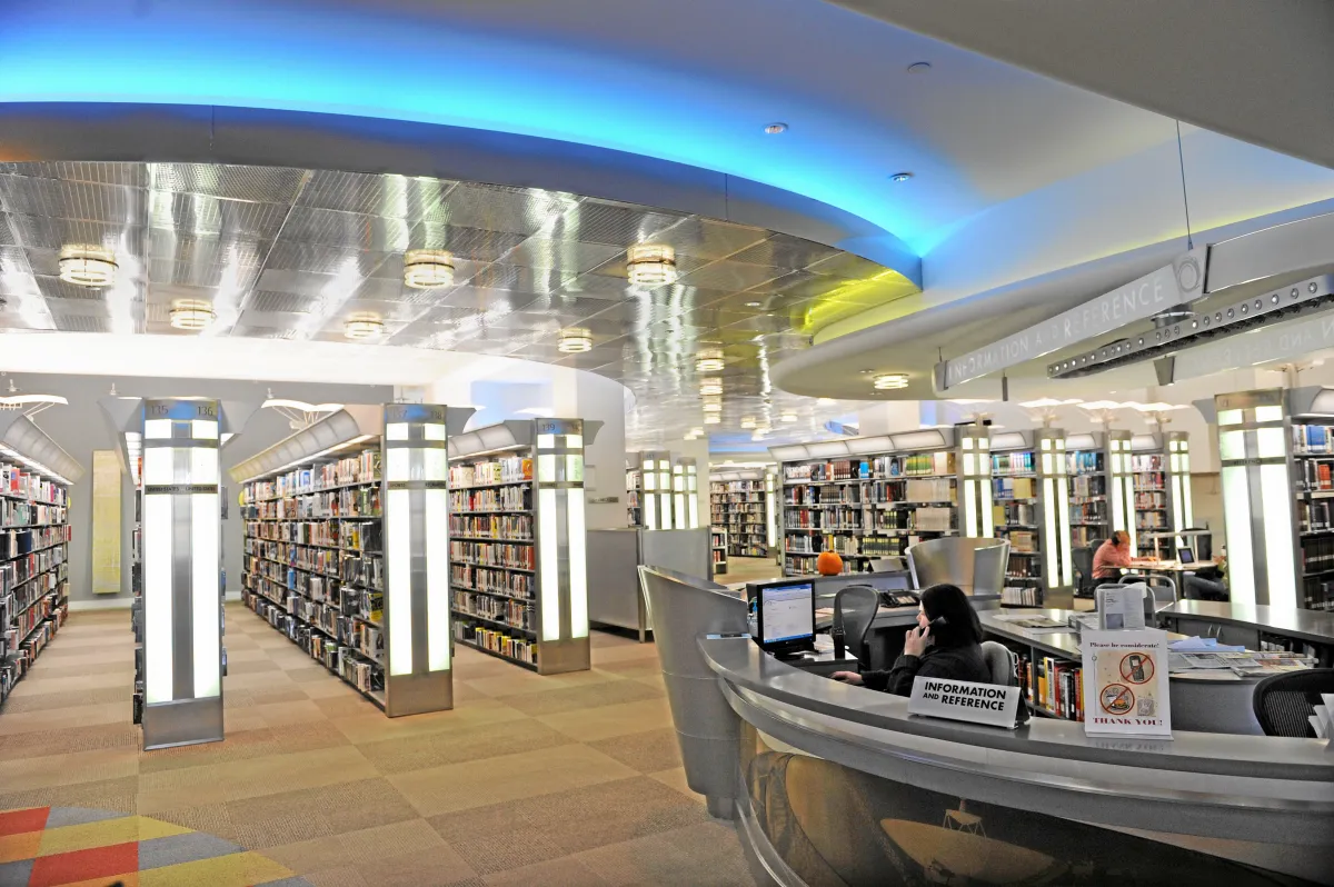
The Cerritos Library features themed spaces, high quality art work, and inspirational architecture. Innovation and creativity have been central to the new Library’s success. It is widely known throughout the library community for its futuristic design.
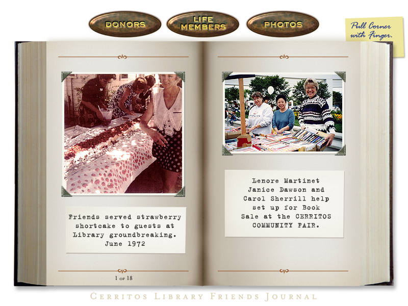
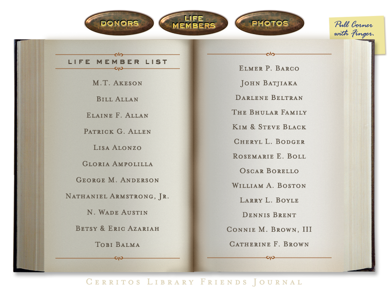
Evolve Media was asked to design the donor wall along with interactive and engaging touch screen content for the display that is featured there. We created the first ever used “page turning” technology effect, programming and animated behavior in an application. This tech has since been used in many other applications and uses through out the world.
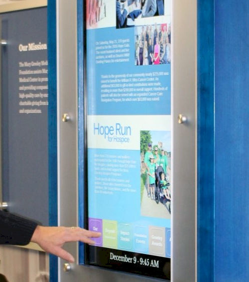
In addition to the donor wall, we were asked to develop other interactive displays in the venue.
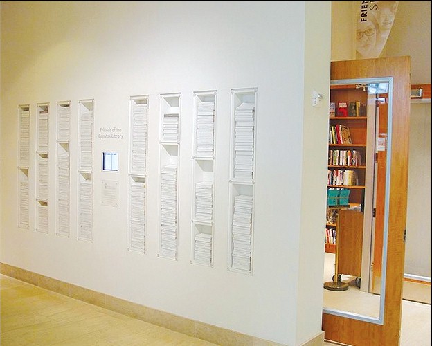
The Cerritos Library Friends Wall was conceived to acknowledge the support and dedication of the Friends who were instrumental in laying the foundation for what has become the city’s crown jewel. The library is known for its progressive design and innovative programs.
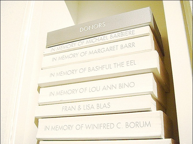
The design challenge was to create a sophisticated, elegant, low-cost, flexible design solution that could be updated by library personnel. The physical challenge was that the wall was located in a narrowing corridor. The theme of “touch” guided the process as it related to many aspects of the project: the notion of integrating a touch screen, the community who have been emotionally touched by the Friends’ devotion, and the physical touch of the books, which have been held, used, and reused by countless people. Used paperback books communicate the emotional links between the people and the books, using the spine of the books to recognize the Friends’ names.
A simple color scheme using whites and grays conveys the graphic information. Used books were sprayed with white paint and grey vinyl lettering was applied to the spine. To distinguish between the two categories (Life Members and Donors), the colors were reversed. The notion of a library shelf is turned on its side by stacking the books, allowing the library staff to delete and insert books and maintain alphabetical order for both categories.
This project seems to be successful on several levels, from recognizing the friends and community who helped build the library to honoring them. The very vehicle (used books) adds to the flexibility and sustainability of the installation.
Sign up to receive updates on our latest articles and happenings