


Last Tuesday, my friend Sarah sat at a local cafe trying to hire a consultant for her firm’s rebranding. The website she visited looked professional at first, but the mobile menu took exactly 4.2 seconds to respond to her touch. She didn’t wait; she simply closed the tab and called a competitor whose site felt instant. This is exactly how subtle digital friction like slow load times or dated design creates a trust gap that silently drives potential clients to competitors.
It’s frustrating to watch your hard earned leads vanish because of a tiny technical hiccup you didn’t even know existed. You know your service is superior, but your digital storefront might be telling a different story to a skeptical visitor. According to a 2023 study, even a one second delay in page load time can result in a 7% reduction in conversions.
Today, we’re going to bridge that gap. You’ll learn how to identify the invisible flaws that frustrate your users and get a clear checklist to fix them. We’ll explore the specific design elements that actually build authority and a roadmap to keep your site running with the precision your brand deserves.
Key Takeaways
- Understand why your website’s “vibe” is actually a critical business metric that either welcomes clients or acts like a confusing, stuck door handle.
- Master a step-by-step framework to audit your own user experience by viewing your site through the eyes of a skeptical first-time visitor.
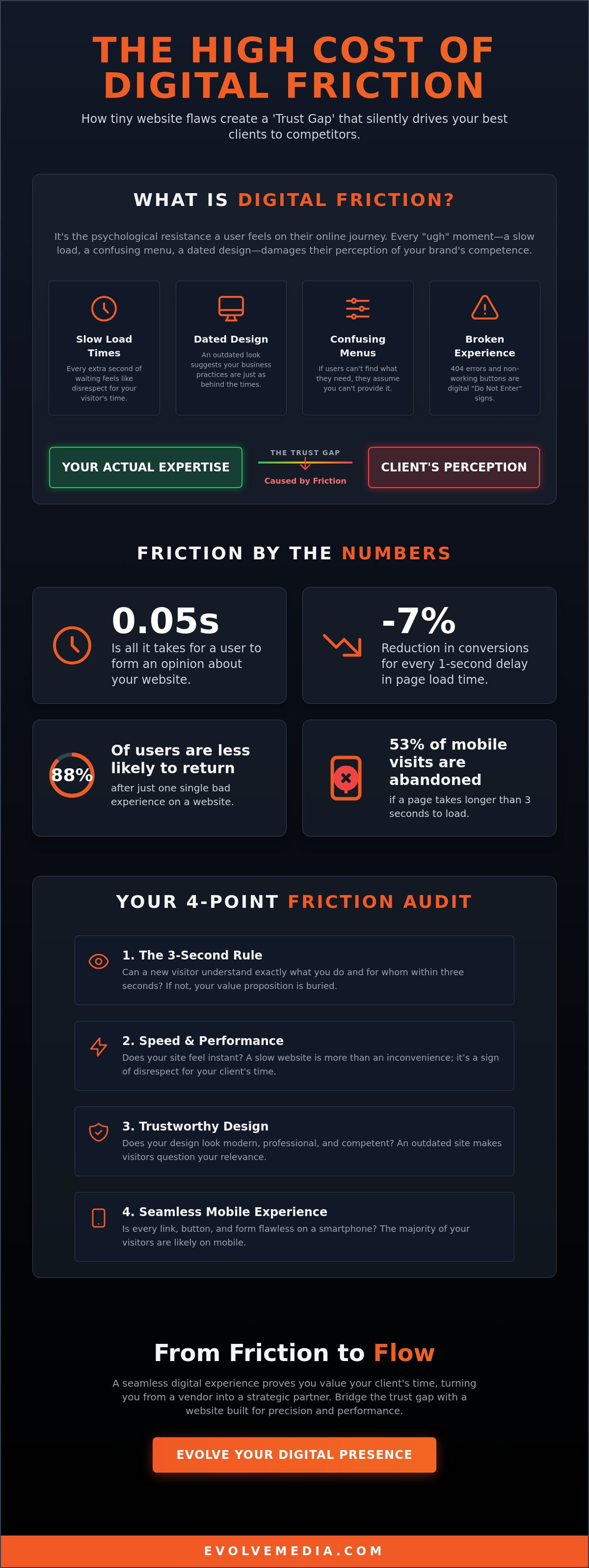
- Learn how subtle digital friction like slow load times or dated design creates a trust gap that silently drives potential clients to competitors, including why a tiny 0.1-second lag can drop conversions by 7%.
- Discover how to transition from being seen as a background vendor to a long-term strategic partner by building a site that actively earns client interest.
The Invisible Wall: Why Your Website’s ‘Vibe’ Is Actually a Business Metric
I recently visited a local hardware store that had a beautiful, heavy brass handle on the front door. Naturally, I pulled it. Nothing happened. I pulled harder, thinking it was stuck, only to realize a tiny, faded sign above the handle said “Push.” In those three seconds of confusion, I felt a flash of irritation. I didn’t blame the door; I felt like the store was poorly managed. If they can’t get the entrance right, how organized is their inventory? This is exactly how your prospects feel when they encounter a clunky website.
Digital friction is the psychological resistance a user feels during their online journey. It’s the “ugh” moment when a button doesn’t click or a menu hides what you’re looking for. While it feels like a technical glitch, it’s actually a branding disaster. At Evolve Media, we’ve been building digital trust since 1996, and we’ve seen how these tiny hurdles can dismantle a reputation faster than any bad review.
To better understand how these tiny hurdles impact your bottom line, watch this helpful video:
The real danger lies in the “Trust Gap.” This is the distance between your actual expertise and your perceived expertise. You might be the most qualified consultant in your field, but if your site looks like it belongs in the era of dial-up, users won’t see a seasoned pro. They’ll see someone who’s out of touch. Research shows that it takes only 0.05 seconds for users to form an opinion about your website. How subtle digital friction like slow load times or dated design creates a trust gap that silently drives potential clients to competitors is a reality many established firms ignore until their lead volume drops.
The Psychology of the Micro-Frustration
Your brain is wired to seek patterns and safety. When a website layout jumps around while loading, your subconscious registers it as a lack of stability. This creates a subtle sense of “danger” or “unreliability.” Professional web design isn’t just about looking pretty; it’s about signaling competence. To truly understand the stakes, we must look at What is User Experience (UX) and how it dictates human behavior. If a site feels “dated,” your brain automatically associates the brand with being slow, unreliable, or behind the times. Users don’t blame the code; they blame your leadership.
Why ‘Good Enough’ Is the Enemy of Conversion
Many successful businesses fall into the “it still works” trap. They assume that because the contact form eventually sends an email, the site is doing its job. However, 88% of online consumers are less likely to return to a site after a single bad experience. While you’re settling for “good enough,” your competitors are using modern, empathetic design to poach your most loyal prospects. A seamless user flow shows that you value your client’s time. It proves you have the empathy to anticipate their needs before they even ask. When the digital path is smooth, trust follows naturally.
Hunting the Silent Killers: How to Audit Your Own User Experience
Think about the last time you walked into a professional office and found a dusty lobby, flickering lights, and a receptionist who didn’t look up from their phone. You probably felt an immediate urge to turn around and walk out. Your website acts as your digital lobby, and when things feel “off,” your visitors react with that same instinct to flee. To find these silent killers, you have to set aside your pride and look at your site through the eyes of a skeptical stranger who has never heard your name.
Start your audit with the three-second rule. If a visitor cannot identify exactly what you do and how it solves their specific problem within three seconds of landing, your value proposition is buried. This lack of clarity is a major red flag. Look for small, annoying friction points like links that lead to 404 errors or “creative” fonts that are impossible to read on a smartphone. This is precisely how subtle digital friction like slow load times or dated design creates a trust gap that silently drives potential clients to competitors.
Speed Isn’t Just Technical; It’s Respect for Your Client’s Time
A slow site is more than a technical glitch; it’s a sign of disrespect. According to data from Google, 53% of mobile visits are abandoned if a page takes longer than three seconds to load. When your site feels sluggish, it signals that your entire business might be behind the curve. While many people focus on the technical differences of User Experience vs. Customer Experience, the reality is that a bad digital interaction ruins the relationship before it even starts. You don’t need to be a developer to test this; tools like PageSpeed Insights can give you a clear score in seconds.
The Visual Trust Gap: When Design Doesn’t Match Expertise
Dated design cues tell your visitors that your business has stopped evolving. If you’re still using grainy stock photos from 2010 or a layout that isn’t optimized for modern screens, you’re creating a visual trust gap. Consistent branding across your site, LinkedIn, and even your email signatures creates a “halo effect” of reliability and professional maturity. Even complex business processes can be salvaged by clean, multi-step online applications that guide the user rather than confusing them. If you aren’t sure where your site is failing you, it might be time to reach out for a professional perspective to see what your potential clients are seeing.
Measuring the Cost of Friction and Bridging the Gap
Think about how much time you waste waiting for a page to load. You probably don’t even realize you’re doing it until it takes a beat too long. Research shows that a 0.1-second delay in load time can reduce conversion rates by 7%. That tiny pause is a leak in your bucket. When you multiply that across your entire customer journey, from the first ad they see to the final checkout button, you’re looking at a massive loss. This is the “Usability Tax.” It quietly inflates your customer acquisition costs because you’re paying for traffic that leaves before they even see what you offer. How subtle digital friction like slow load times or dated design creates a trust gap that silently drives potential clients to competitors is often the difference between a thriving year and a stagnant one.
The ROI of a Frictionless Experience
If your homepage has a 40% bounce rate, you’re essentially throwing away nearly half of your marketing budget. It’s a painful reality for many businesses that don’t realize their site is working against them. It’s not just about lost sales; it’s about the hidden strain on your team. A clunky site leads to more “where is my order” emails and confused support tickets. When things work perfectly, your team can focus on growth instead of putting out fires. A frictionless website isn’t a luxury; it’s the primary engine of modern business growth. Custom web development acts as a silent partner here. It removes those invisible barriers that frustrate users and makes every interaction feel effortless.
Implementing a Trust-First Digital Architecture
Trust isn’t something you can just ask for; you have to build it into the bones of your site. This starts with a clear hierarchy and total transparency. People should know exactly where to click next without having to think about it. We use clear CTAs and social proof to bridge the gap between “just looking” and “ready to buy.” Reliability is also a major factor. This is why managed hosting is the unsung hero of digital trust. It ensures your site stays up and runs fast, even during traffic spikes. Since 1996, we’ve seen how these technical choices create lasting emotional security for your clients. By prioritizing ease of use, you prove you value their time and their business.
If you are ready to stop losing visitors to invisible hurdles, let’s build a site that works for you.
Evolving Beyond Friction: How to Build a Site That Earns Interest
Fixing a slow website isn’t just about technical maintenance; it’s a strategic move to save your brand. When you ignore the small stuff, you’re essentially letting a leaky faucet ruin your foundation. How subtle digital friction like slow load times or dated design creates a trust gap that silently drives potential clients to competitors is a reality we see every day. Research from Toptal shows that 88% of online consumers are less likely to return to a site after one bad experience. This means a single glitch can cost you a lifetime of revenue before you even know there’s a problem.
Choosing a Partner Who Sees the Big Picture
You don’t need a vendor who just checks boxes and writes code. You need a partner who understands your business goals from the ground up. Since 1996, our team has helped brands navigate the messy parts of the internet with calm confidence. We act as a Wise Architect for your digital home, using decades of institutional knowledge to ensure your site stays relevant as tech shifts. We aren’t just here to build a page; we’re here to help you grow. You can learn more about our philosophy on our about us page.
Moving from Transactional Sites to Strategic Assets
Think of your website as a salesperson who never sleeps. It’s a 24/7 asset that represents your professionalism when you aren’t in the room. To keep it sharp, you have to avoid design debt. This happens when you let small issues pile up until the whole system feels dated and clunky. We use modern tools like AI to reduce user effort, making sure every click feels natural and easy for your visitors. Your site should be as professional as you are, and that requires constant care rather than a one-and-done approach.
Before you jump into a redesign, use this quick checklist to ensure you’re on the right track:
- Audit your speed: Aim for a load time under 2 seconds to keep users engaged.
- Check your mobile flow: Make sure buttons are easy to tap and forms are simple to fill out.
- Review your navigation: A user should find your contact info in less than 3 seconds.
- Integrate AI support: Use smart tools to answer common questions instantly and reduce friction.
We’d love to help you turn your website into a growth engine. If you’re ready to work with a team that pours their heart and soul into every pixel, reach out to us today. Let’s build something that earns the interest and trust your business deserves.
Turning Your Digital Friction into a Welcome Mat
Your website shouldn’t feel like a locked door. When a page takes more than three seconds to load, Google research shows that 53 percent of mobile visitors will simply walk away. That’s a lot of potential trust left on the table before you even get to say hello. We’ve explored how to audit your user experience and why your site’s vibe is a real business metric that impacts your bottom line. It’s vital to recognize how subtle digital friction like slow load times or dated design creates a trust gap that silently drives potential clients to competitors.
Since 1996, our dynamite team has focused on turning these digital hurdles into smooth pathways that drive ROI. We specialize in custom solutions for complex business logic, ensuring your site works as hard as you do. You deserve a platform that reflects your expertise rather than hiding it behind technical glitches. Let’s make sure your first impression is the right one.
Ready to close the trust gap? Let’s chat about your project.
We’re excited to help you build a digital home that invites people to stay a while.
Frequently Asked Questions
I once walked into a high-end bakery because the smell of sourdough was calling my name. The door handle looked like a pull, but it was actually a push. I stood there for five seconds looking like a fool. That tiny moment of confusion made me want to leave before I even saw a croissant. That’s friction, and it happens on your website every single day.
What exactly is digital friction and why should I care?
Digital friction is any hurdle that prevents a visitor from completing a task on your site. It matters because how subtle digital friction like slow load times or dated design creates a trust gap that silently drives potential clients to competitors. If a user has to think too hard, they’ll leave. Since 1996, we’ve seen that a 0.1 second delay in mobile load times can lower conversion rates by 8 percent according to a 2020 Deloitte study.
How do I know if my website design is considered ‘dated’ by today’s standards?
Your site is likely dated if it hasn’t seen a major visual update since 2021. Modern users expect clean layouts and mobile-first navigation. If your site still uses tiny fonts or non-responsive sidebars, you’re losing people. Research from Stanford shows that 75 percent of users judge a company’s credibility based on its website design. If it looks like a relic, clients assume your services are behind the times too.
Can a slow website really affect my brand’s reputation?
A slow site makes your business look unprofessional and unreliable. When a page takes longer than 3 seconds to load, 40 percent of people will abandon it entirely. This creates a sense of frustration that colors their entire perception of your brand. We’ve been building digital spaces since 1996, and we know that speed is the foundation of trust. If you can’t manage your own website speed, clients worry you’ll be slow to deliver.
What are the most common points of friction on a B2B website?
The most common friction points are complex forms, hidden contact information, and broken links. B2B buyers often want to find specific technical data quickly. If they have to fill out a 10 field form just to see a PDF, they’ll often bounce. In fact, reducing form fields from 11 to 4 can increase conversions by 120 percent according to HubSpot data. Making your site easy to navigate shows you value your partner’s time.
How much does it cost to fix digital friction on my site?
Costs vary based on your site’s complexity, but fixing friction should be viewed as a high-yield investment. Small fixes like optimizing images or cleaning up navigation are relatively affordable. Large-scale structural changes cost more. While we don’t provide flat rates without a discovery session, Forrester research suggests that for every 1 dollar spent on UX, the return on investment can be as high as 100 dollars. It’s about protecting your revenue.
Is it better to patch an old site or start a custom web development project from scratch?
It’s usually better to start fresh if your site’s core code is more than 5 years old. Patching a legacy system often costs more in the long run because you’re fighting against outdated architecture. A new build allows you to integrate modern AI tools and SEO best practices from the ground up. Think of it like a house; sometimes it’s cheaper to rebuild than to fix a crumbling foundation and outdated wiring.

