


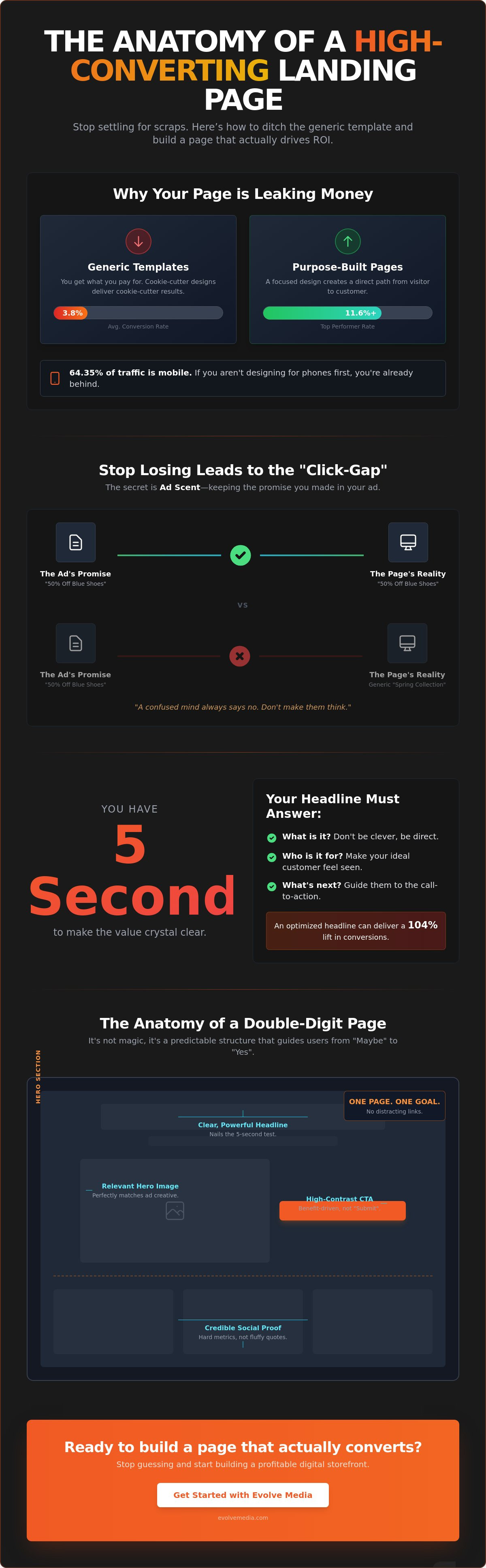
If your landing page relies on a generic template, you’re likely settling for a 3.8% conversion rate while custom-designed competitors are hitting 11.6% or higher. It’s a bitter pill to swallow when you’re watching a healthy ad budget disappear into high bounce rates. Most high-converting landing page design advice is buried under layers of corporate-speak that makes a simple goal feel like rocket science.
Since our founding in the early days of the web, we’ve seen this cycle too many times. You know your product works, but your page feels like it’s speaking a language your customers don’t understand.
You deserve a digital storefront that works as hard as you do. We agree that a page should be a functional bridge between a problem and a solution, not just a piece of digital art. In this guide, we’ll show you how to use specific psychological triggers and design logic to turn skeptical visitors into loyal customers. We’re moving past the fluff to give you a clear, actionable checklist that drives real ROI. You’ll learn how to optimize your headlines for a potential 104% lift and why mobile-first design is the only way to capture the 64.35% of traffic now coming from phones.
Key Takeaways
- By mastering the art of Ad Scent, you’ll stop losing leads to the “click-gap” and ensure your page instantly honors the promise of your ads.
- Build the essential anatomy of a 10%+ page by focusing on a hero section that earns a “yes” before the user even thinks about scrolling.
- Implement specific tweaks for high-converting landing page design that replace fluffy testimonials with the hard metrics your customers actually trust.
- To stop treating your layout like a guessing game, use a simple testing framework that identifies which changes actually drive action.
The Psychology of the Click: Why Most Designs Fail
Most landing pages fail because they are designed to look “pretty” rather than to be “profitable.” In the digital world, aesthetics often act as a distraction. You might have a stunning layout, but if it doesn’t align with why the visitor clicked in the first place, they’ll leave faster than you can check your analytics. A truly high-converting landing page design starts long before someone reaches your URL. It begins with the promise made in your ad or email.
This connection is known as Ad Scent. Think of it as a trail of breadcrumbs. If your ad promises a “50% Discount on Blue Suede Shoes” but your page shows a generic “Spring Collection” banner, the scent is lost. The visitor feels confused, and a confused mind always says no. To bridge this gap, you need to match the visual cues, the specific offer, and the exact language from the source to the destination.
To see how these psychological triggers translate into a physical layout, watch this breakdown of the process:
While the median conversion rate across industries sits at about 6.6%, top performers consistently hit 10% or higher. Reaching that double-digit mark requires a commitment to Landing page optimization (LPO). It isn’t a one-time setup; it’s a process of refining the bridge between a user’s problem and your solution.
Intent Matching: Giving Them Exactly What They Asked For
Intent matching is the alignment of user expectation with page reality. If someone searches for “Red Running Shoes,” landing them on a general footwear page is a recipe for a high bounce rate. You must give them the specific item they requested. Use visual anchors to confirm they are in the right place:
- Bold your primary offer so it’s the first thing they see.
- Use bullet points to list the exact specs mentioned in the ad.
- Ensure the hero image matches the ad’s creative perfectly.
The 5-Second Rule of Web Design
Visitors decide whether to stay or leave in less time than it takes to blink. Your headline has to do the heavy lifting immediately. It must answer three questions: What is it? Who is it for? What do I do next? Don’t hide these answers behind clever wordplay or vague taglines. If your high-converting landing page design doesn’t make the value clear in five seconds, you’ve already lost the sale. Get straight to the point and skip the fluff.
The Essential Anatomy of a 10%+ Conversion Rate
Achieving a double-digit conversion rate isn’t about luck. It’s about a predictable structural rhythm that guides a visitor from curiosity to commitment. Every high-converting landing page design we’ve built since our early days relies on a single-goal philosophy. If you give people five options, they’ll choose none of them. One page, one purpose, one action.
Your hero section is the digital equivalent of a firm handshake. It needs to establish trust and value before the user even thinks about scrolling. By using size, color, and generous whitespace, you create a visual hierarchy that tells the brain exactly what to prioritize. This structure includes several must-have elements that turn a static site into a high-performing engine.
Visual hierarchy isn’t just about making things big. It’s about contrast. If everything is bold, nothing is. We use whitespace to let your value proposition breathe, ensuring the most important information doesn’t get lost in the noise.
The Power of the Primary CTA
Don’t treat your Call to Action like a polite suggestion. It should be a clear, direct command. We’ve found that high-contrast colors make the path forward unmissable. Your copy should focus on the benefit the user receives, not the work they have to do. Instead of a boring “Submit” button, try “Get My Free Guide” or “Start My Trial.” It’s a small tweak that shifts the focus from effort to reward.
Visual Flow: The Z and F Patterns
Most people scan web pages in very specific ways. In 2026, users still favor the top-left corner and horizontal headers, following what designers call the F and Z patterns. You can nudge this behavior using directional cues. A simple arrow pointing at your form or a photo of a person looking toward the headline can naturally guide the eye. If you’re feeling overwhelmed by the technical side of these layouts, feel free to reach out to our team for a second pair of eyes.
Keep your text blocks lean. Long, heavy paragraphs are where conversions go to die. Stick to three-sentence blocks and use ultra-short sentences to keep the momentum going. This variety breaks the rhythm and prevents the reader’s brain from switching to autopilot. It keeps them focused on the only thing that matters: the click.
Design Tweaks That Move the Needle (No Fluff Edition)
Forget about high-level strategy meetings for a second. Let’s look at the actual pixels on your screen. A high-converting landing page design isn’t a static document; it’s a living machine that requires precise calibration. While your competitors are busy “reimagining their vision,” you can win by simply adjusting the elements that actually influence human behavior.
Generic praise is background noise. If your landing page says “Best Service Ever,” nobody believes you. It’s too vague to be true. Replace that fluff with “We helped a client increase sales by 22% in 30 days.” That is a number people can visualize. It’s a result they can want for themselves.
Establishing Real-World Credibility
Specific metrics are gold. We’ve found that when you swap “industry leader” for a specific data point, trust levels spike. Use logos of recognized brands or industry certifications as “Trust Badges” to act as cognitive shorthand for reliability. This level of credibility is especially vital for ecommerce development where the distance between a click and a purchase is razor-thin. If you want to see how your current trust markers stack up, let’s chat about a site audit.
Less is always more when it comes to capturing leads. Research shows that shortening a form from 11 fields to just 4 can lead to a 120% increase in conversions. Every extra box you ask a visitor to fill out is a hurdle. Ask only for what you absolutely need to start the relationship.
The Technical Backbone: Speed and Stability
Speed is a design element, not just a developer’s metric. A one-second delay in page load can drop conversions by 7%. If your page takes too long to load, your beautiful design won’t even be seen. We prioritize professional hosting to ensure high uptime, especially during the heavy traffic of an ad campaign. In 2026, mobile-first design is the baseline. With 64.35% of web traffic now coming from mobile devices, your page must be as fast and functional on a five-inch screen as it is on a desktop. If it isn’t, you’re essentially throwing away more than half of your ad budget.
Beyond the Layout: Testing Your Way to Perfection
Design is never the finish line. It’s a hypothesis. Even the most beautiful high-converting landing page design is really just an educated guess until your actual customers weigh in. We don’t believe in guessing. We believe in proof.
By using heatmaps, you can see exactly where your users are getting stuck or which sections they’re ignoring. If people are clicking on a static image thinking it’s a button, that’s a friction point you need to fix immediately. This data shouldn’t live in a vacuum; it should inform your entire digital marketing strategy.
The 3-Day A/B Test Framework
You don’t need months of data to make a decision. A quick, focused test can give you all the answers you need. Here is how we do it:
- Step 1: Identify your weakest link. Is your bounce rate high? That’s a headline issue. Is your click-through rate low? That’s a CTA issue.
- Step 2: Create a “Challenger” version. Change exactly one variable, like your headline or the color of your primary button, to see what actually drives the change.
- Step 3: Run your traffic and let the numbers do the talking. The version that produces the most leads wins; it’s as simple as that.
The ROI of Professional Design
Numbers don’t lie. Calculate your Cost Per Lead (CPL) before you make any changes. If you spend $2,000 on ads and generate 20 leads, your CPL is $100. By applying the principles of high-converting landing page design and bumping your rate from 4% to 8%, that same $2,000 now nets you 40 leads. You’ve just cut your acquisition cost in half.
DIY templates are fine for hobbyists, but they often lack the psychological nuance required for enterprise growth. You need a partner who understands the balance between tradition and innovation. We’ve been building digital propellants for growth since 1996, and we’d love to do the same for you. Contact us today to start turning those casual visitors into paying customers.
Stop Guessing and Start Growing
Your landing page shouldn’t be a shot in the dark. It’s the functional bridge between a customer’s problem and your specific solution. By mastering Ad Scent and prioritizing a single-goal layout, you’ve already moved ahead of the 6.6% industry average. But the real magic happens when you stop treating high-converting landing page design as a one-time project and start treating it as an ongoing conversation with your data.
We don’t just build pages; we build strategic partnerships. Since 1996, we’ve been refining our expertise in custom online applications and ecommerce development to ensure our clients don’t just look professional, they drive action. You deserve a team that acts as a propellant for your growth, not just another background vendor.
The path to a 10% conversion rate is clear. It requires speed, psychological precision, and a commitment to testing what works. Let’s build a landing page that actually works—get in touch with Evolve Media. We can’t wait to see what we can build together.
Common Questions About Landing Page Performance
What is a good conversion rate for a landing page in 2026?
A good conversion rate typically falls between 4% and 6%, though the top performers in most industries aim for 10% or higher. While the median rate across the web is around 6.6%, your specific goal depends on your traffic source and offer. If you’re currently seeing 2%, focus on aligning your ad scent before worrying about the smaller design details.
Should I use video on my landing page to increase conversions?
Yes, but focus on interactive demos rather than long, static sales pitches. In 2026, users prefer experiencing a product through a quick walkthrough or a 30-second benefit-focused clip. Just keep an eye on your page speed; a heavy video file that adds two seconds to your load time will likely cost you more in bounces than it gains in engagement.
How many fields should my landing page form have?
You should aim for four fields or fewer to keep friction at a minimum. Research indicates that shortening a form from 11 fields to 4 can lead to a 120% increase in conversions. Every extra box you ask a visitor to fill out is another reason for them to leave, so only ask for what’s absolutely necessary to start the relationship.
What is the difference between a homepage and a landing page?
A homepage is a digital front door meant for exploration, while a landing page is a focused tool built for a single action. Homepages usually have navigation menus and multiple links that can distract a visitor. A high-converting landing page design strips away those distractions to ensure the user has only one path forward: your primary call to action.
Can I use a landing page template, or do I need a custom design?
Templates are a fine starting point, but custom designs typically convert at 11.6% compared to the 3.8% average for generic layouts. Custom work allows you to build a page around your specific audience’s psychological triggers rather than trying to fit your message into a pre-made box. It also ensures your site is free of the “code bloat” that often slows down template-based pages.
How often should I A/B test my landing page design?
You should run a test whenever you have a specific hypothesis to prove, such as “will a red button outperform a green one?” For websites with lower traffic, specifically those under 1,000 weekly visitors, it’s better to implement proven best practices first. Once your traffic scales, use a 3-day test framework to isolate one variable at a time so you know exactly which change moved the needle.

