


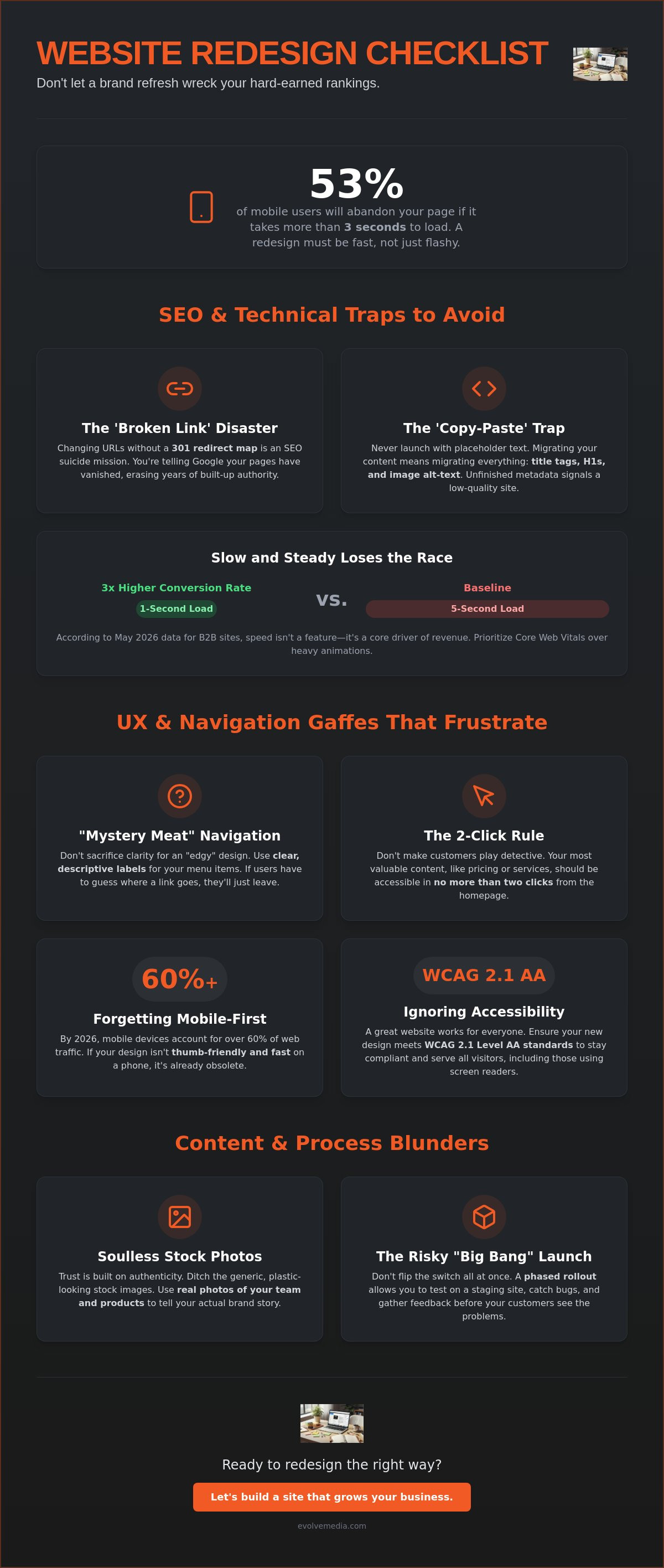
Did you know that 53% of mobile users will abandon a page if it takes longer than three seconds to load? It’s a sobering thought when you’re planning a visual overhaul. Most people treat a redesign like a simple paint job, but it’s actually more like moving a house while the family is still sleeping inside. You want the new look, but you can’t afford to break the foundation. If you aren’t careful, the most common website redesign mistakes to avoid can turn a brand refresh into a digital disappearance act.
We know the anxiety that comes with clicking “publish” on a new site. You’ve spent years building your SEO authority, and the fear of watching your Google rankings tank is very real. You want a site that converts better, not just one that looks pretty while your sales numbers stall. We’ve seen these hurdles before, and we’re here to ensure your transition is as smooth as possible.
In this guide, you’ll learn how to modernize your presence while keeping your hard-earned traffic intact. We’ll walk through a stress-free checklist for 2026 that covers everything from GA4 integration to the latest May 2026 Core Update requirements. Let’s make sure your budget goes toward growth, not fixing expensive errors after the site goes live.
Key Takeaways
- Protect your search rankings by mapping 301 redirects and migrating metadata so you don’t lose the organic traffic you’ve spent years building.
- Identify the common website redesign mistakes to avoid, such as burying your most important information under layers of “edgy” but confusing navigation.
- Build authentic trust with real stories and custom photos instead of stripping away your “About Us” page or using generic, plastic-looking stock images.
- Ditch the risky “Big Bang” launch for a phased rollout and test your staging site on multiple browsers to catch bugs before your customers do.
- Ensure your new design meets WCAG 2.1 Level AA standards to stay compliant with 2026 accessibility requirements and serve all your visitors.
The SEO and Technical Traps That Hide in Plain Sight
A website redesign is often treated like a high-end renovation. You pick the colors, the furniture, and the lighting. But if you forget the plumbing and wiring, the whole thing eventually fails. In the digital world, that “plumbing” is your SEO foundation. One of the most common website redesign mistakes to avoid is focusing so much on the visual layer that you accidentally delete your search engine visibility.
The ‘Broken Link’ Disaster
Changing your URL structure without a plan is an SEO suicide mission. When you move a page without telling Google where it went, you lose every bit of authority that page accumulated over the years. A 301 redirect is a digital forwarding address. It tells search engines and users that the content they’re looking for has moved permanently to a new home. Before you touch a single line of code, use a crawler to map your old site and create a master list of every existing URL. This ensures no page is left behind to rot in a 404 error grave.
Metadata and the ‘Copy-Paste’ Trap
Content migration is tedious. It’s tempting to just copy the text and worry about the “meta stuff” later. Don’t do it. Leaving default title tags like “New Page 1” in place tells Google your site is unfinished or low quality. Missing H1 tags and alt-text for images will cripple your 2026 search visibility, especially as AI-powered search engines rely on clear structures to understand your value. We’ve seen these technical hurdles before. At Evolve Media, our history of managing complex site migrations dates back to 1996, giving us the perspective needed to protect your rankings while you grow.
Success requires balancing aesthetics with core web design principles like performance and accessibility. You might love that heavy, full-screen video background, but if it pushes your Largest Contentful Paint (LCP) over the 2.5-second mark, your users will leave. According to May 2026 data, B2B sites that load in 1 second have conversion rates three times higher than sites that load in 5 seconds. Prioritize site speed and Core Web Vitals over flashy animations that don’t serve a functional purpose.
Finally, remember the “handshake” with Google. Once the site is live, you must update your XML sitemap and check your robots.txt file. It’s a simple step, but failing to do it can delay your new pages from being indexed for weeks. Don’t let your common website redesign mistakes to avoid start with technical neglect.
UX and Navigation Gaffes That Frustrate Your Visitors
Navigation is the roadmap of your site. When brands try to be “edgy” by hiding the menu behind a cryptic icon, they usually just confuse people. One of the most common website redesign mistakes to avoid is sacrificing usability for aesthetics. If your visitors have to think about how to move around, you’ve already lost them.
Avoid “mystery meat” navigation. This happens when you use icons without labels, assuming everyone knows what a gear or a three-dot menu means. It adds friction. Stick to clear, descriptive text that tells users exactly where they’re going.
Don’t make your customers play detective. If a user has to click three or four times just to find your pricing or service list, they’ll likely bounce. We recommend keeping your most valuable content no more than two clicks away from the homepage. This keeps the path to conversion short and sweet.
Mobile-First is Not a Suggestion
By 2026, mobile devices account for over 60% of all web traffic. If your redesign looks stunning on a 27-inch monitor but feels cramped on a smartphone, it’s a failure. Users expect thumb-friendly buttons. They want assets that load in under 3 seconds. Try navigating your staging site with one hand while walking. If you can’t reach the main CTA with your thumb, your layout needs a tweak. For those running shops, our strategic guide to ecommerce development offers deeper insights into mobile-optimized checkouts.
The Friction of ‘Too Many Choices’
Mega-menus are often conversion killers. Giving a user fifty options at once leads to choice paralysis. Use a clear visual hierarchy instead. Point them toward your primary goal. This isn’t just about sales; it’s about accessibility. Following a comprehensive website redesign guide helps ensure you’re meeting WCAG 2.1 Level AA standards. Your site should work for everyone, including those using screen readers.
Use this quick checklist for your new navigation:
- Keep the main menu to 7 items or fewer.
- Label icons clearly with text.
- Ensure the “Contact” or “Cart” button is always visible.
- Test the click targets on the smallest mobile screens.
If you’re feeling stuck on how to organize your content, we’re always happy to chat about your site’s structure.
Content and Branding Missteps: When ‘New’ Isn’t ‘Better’
Sometimes, in the rush to look modern, companies accidentally scrub away the very things that make them human. It’s a classic trap. You trade a slightly dated site that actually sells for a “sleek” one that feels like a ghost town. One of the most common website redesign mistakes to avoid is treating your content like an afterthought to the layout. If your brand story gets lost in the shuffle, no amount of white space will save your conversion rate.
People buy from people they trust. Stripping away your “About Us” story or replacing real team photos with generic stock images is a huge mistake. A photo of two models in suits shaking hands doesn’t build authority; it signals that you’re using a template. Use real photography. Even if it’s not perfect, it’s authentic. Authentic brands win in 2026.
Another pitfall is writing for search engines instead of the human friend over coffee. Yes, SEO matters, but if your text is a dry list of keywords, nobody will read it. Your high-performing pages from the old site contain clues about what your audience actually likes. Don’t delete that “ugly” blog post that brings in 40% of your leads just because the header doesn’t match the new brand colors.
The Death of Brand Personality
Sounding like a corporate robot is the fastest way to lose a lead. Your voice is your brand. It’s the way you reassure a worried client or celebrate a win with them. Even if you change your logo and your palette, your core message must stay consistent. If you aren’t sure if your new copy hits the mark, you can contact our team for a brand voice audit to keep your personality intact.
Data-Driven Design vs. Gut Feelings
Don’t redesign based on the CEO’s favorite color. Use Heatmaps to see where people actually click before you delete a sidebar or move a contact form. A data-driven redesign is the practice of making layout and content choices based on verified user interaction metrics rather than subjective aesthetic preferences. If the data shows that your “ugly” sidebar is where 60% of your newsletter signups happen, keep it.
Check these content boxes before you go live:
- Audit your top 10 most-visited pages and preserve their core message.
- Replace at least 80% of stock imagery with original brand photos.
- Read your new copy out loud; if it sounds stiff, rewrite it.
- Ensure your primary CTA is visible on every single page.
Ready to ensure your new look actually performs? Let’s review your content strategy before the big launch.
Setting Up a Redesign Process That Actually Works
The “Big Bang” launch is a relic of the past. Flipping a switch and hoping for the best is how you end up with a broken checkout or a 404 error on your best-selling product page. One of the most common website redesign mistakes to avoid is rushing the finish line without a safety net. Instead of a single, stressful event, treat your launch as a phased rollout. This allows you to catch minor bugs before they impact your entire audience.
Communication is the engine of a successful project. You need a clear feedback loop with your development team. If you’re only talking about colors and fonts, you’re missing the point. A redesign should be a strategic propellant for your growth. It’s about how the site functions for your users and your bottom line. We’ve found that the most successful projects happen when the client and agency act as long-term partners, not just distant vendors.
The Staging Site Checklist
Never, ever push code directly to your live site. That’s a recipe for disaster. Use a staging environment to test every single button and form. Does the contact form actually send an email? Does the payment gateway work on an iPad? You should even consider running a 3-day A/B test on specific pages to see if the new design actually converts better than the old one. If your 1-second load time drops to 5 seconds during testing, you know you have work to do before the public sees it.
Choosing Your Digital Partner
Look for a partner who asks about your business goals, not just your aesthetic tastes. You want someone who understands that a “pretty” site is useless if it doesn’t sell. Long-term stability matters too. Managed hosting ensures your site stays fast and secure long after the initial excitement of the launch fades. At Evolve Media, we specialize in custom online applications that don’t just look good but actually streamline your business logic and data flow.
Before you go live, verify these final steps:
- Test all third-party integrations like your CRM and email marketing tools.
- Run a final speed test to ensure you’re hitting those Core Web Vitals targets.
- Double-check your 301 redirects one last time.
- Ensure your team knows how to update the new CMS without breaking the layout.
A redesign doesn’t have to be a nightmare. When you focus on the data and the user experience, the results speak for themselves. You’ll end up with a modern site that maintains your SEO authority and actually helps your business grow.
Your Path to a Stress-Free Launch
A redesign is a massive investment in your brand’s future. It’s easy to get lost in the aesthetics, but the real win comes from protecting your foundation. By mapping your redirects, prioritizing mobile users, and keeping your unique brand voice, you’re building a site that doesn’t just look better; it performs better. Understanding the common website redesign mistakes to avoid is the first step toward a digital presence that actually grows your business.
We’ve been at this since 1996. Over the decades, we’ve refined our expertise in complex site migrations. This ensures our partners never have to choose between a fresh look and their hard-earned search rankings. Our approach is built on a strategic focus on ROI and deep user engagement. We don’t just hand over a set of files and wish you luck. We act as a long-term partner in your success.
The transition to a new site should be an exciting milestone, not a source of anxiety. With the right data and a clear process, you can launch with total confidence. Ready to redesign without the stress? Let’s talk about your project. We can’t wait to hear your story.
Frequently Asked Questions
What is the most common mistake in website redesign?
The biggest mistake is prioritizing aesthetics over functionality and SEO. A site that looks like a masterpiece but stays invisible in search or confuses your visitors is a waste of your budget. You need a balance of strategic branding and technical precision to ensure your new look actually converts. It’s about how the site works, not just how it looks.
How do I not lose SEO when redesigning?
You must map 301 redirects for all old URLs to their new homes to avoid the most common website redesign mistakes to avoid. Don’t forget to migrate your metadata and H1 tags too. Skipping these steps can lead to a 30-50% drop in organic traffic almost immediately after launch. We’ve seen it happen, and it’s a painful way to start a new chapter.
How often should you redesign a website?
Most businesses should consider a refresh every 2 to 3 years to keep up with fast-moving tech and user expectations. However, you should let your business goals lead the way. If your conversion rates are stalling or your site feels slow on mobile, it’s time for a change. Don’t redesign just because you’re bored with the current layout.
What should a website redesign checklist include?
Your checklist must cover SEO, UX, Performance, and Content. Ensure your site loads in under 3 seconds and that all forms work perfectly on a staging site before you go live. High-performing sites in 2026 require thumb-friendly navigation and clear, authentic brand stories that build trust. Test everything on multiple browsers to catch bugs early.
Why do most website redesigns fail?
They fail because they lack a clear purpose or “why” behind the changes. If you redesign just to look modern without checking your user data, you might delete the exact features that were driving your sales. Success requires deep research and a partner who understands the technical side of the move. Failure is usually the result of poor execution and a lack of data.
What is the first step in a website redesign?
The first step is a thorough audit of your current site to see what’s working and what isn’t. Use your GA4 data to find your top traffic drivers and high-bounce pages. This information acts as your blueprint. It helps you build a new digital home that keeps your best assets intact while fixing the parts that were holding you back.

