


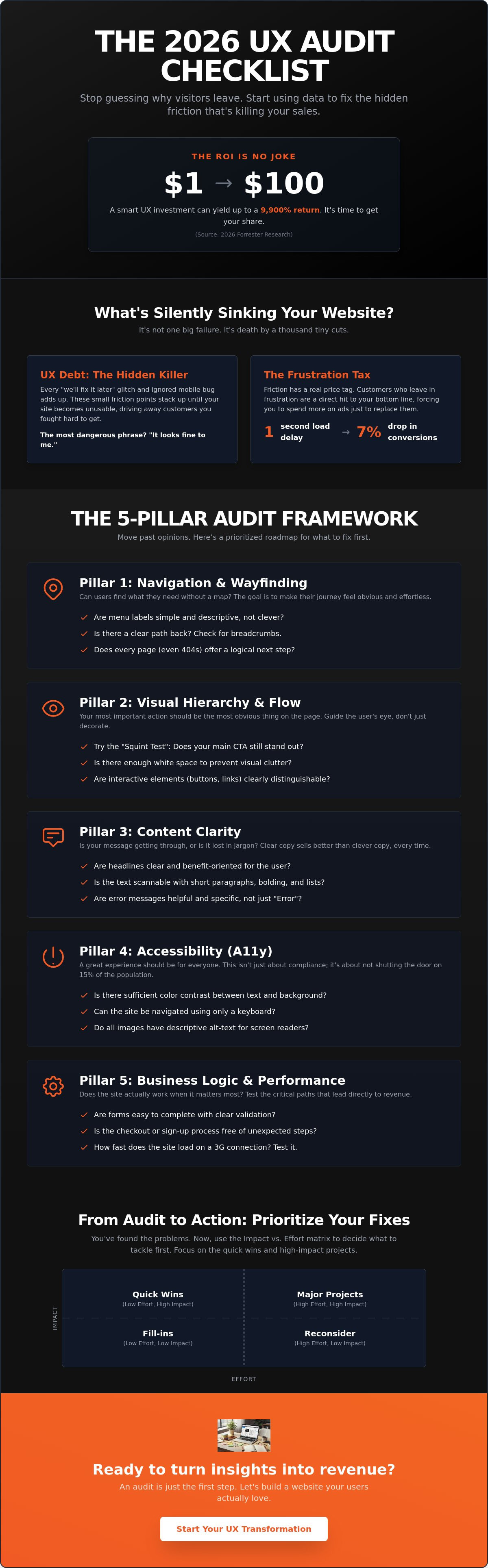
Did you know that for every dollar you put into your site’s design, you could be getting $100 back? That is a potential 9,900% ROI according to 2026 Forrester research. Yet, most teams are still throwing darts in the dark, wondering why their traffic is high but their sales remain flat. If your internal meetings have turned into a debate club about which button color “feels” better, it is time to stop the guesswork. Our comprehensive user experience (UX) audit checklist is designed to move you past opinions and toward hard, data-backed evidence.
We get it. It’s incredibly frustrating to watch visitors land on your page only to vanish seconds later. You’ve likely heard the complaints that the site is “hard to navigate,” but without a clear map, you’re just patching holes in a sinking ship. Stop guessing why visitors leave and start using this actionable checklist to uncover the hidden friction points killing your conversions.
We’ve built a prioritized roadmap of what to fix first, grounded in substance rather than vague advice. You’re about to learn how to identify “UX debt” and use an Impact vs. Effort matrix to decide which changes will actually move the needle. It’s time to stop the internal disagreements and start building a site your users actually love.
Key Takeaways
- Identify “UX debt” before it tanks your sales, moving past the “it looks fine” trap that keeps internal teams stuck in endless debates.
- Get your hands on our 2026 user experience (UX) audit checklist to evaluate your site across five critical pillars, including navigation and legal accessibility requirements.
- Stop guessing with your gut and start using data-backed tools to see exactly where users are clicking, scrolling, and getting stuck.
- Learn how to use the Impact vs. Effort matrix to turn a long list of problems into a prioritized roadmap of quick wins and strategic projects.
Why Your Website Feels Broken (and How a UX Audit Fixes It)
Think of UX debt as a high-interest credit card for your website. Every time you ignore a small glitch or skip a mobile optimization step, you’re racking up a balance. Eventually, those tiny friction points pile up until they kill your conversion rate. It’s not usually a single massive error that drives people away; it’s the “death by a thousand cuts” caused by a confusing menu here and a slow-loading image there.
The most dangerous phrase in any office is “it looks fine to me.” This usually comes from someone who has memorized where every button lives. They don’t see the struggle because they aren’t looking with fresh eyes. A proper user experience (UX) audit checklist forces you to stop relying on internal opinions and start looking at how real humans actually move through your digital space.
To better understand how this process works in practice, watch this helpful video:
There is a massive difference between a UI refresh and a UX audit. Think of a UI refresh as a fresh coat of paint on a car that won’t start. It looks great in the driveway, but it’s not going anywhere. A UX audit is the engine check. It digs into the mechanics of why people leave. You might need an audit if you’re seeing red flags like high cart abandonment, suspiciously low time-on-page, or support tickets that keep asking the same simple questions.
The Cost of Ignoring Friction
Friction is the silent barrier between your user and the “buy” button. Even a tiny delay has a massive price tag. For example, a 1-second delay in page load time can lead to a 7% drop in conversions. If your site brings in $100,000 a month, that “minor” lag is costing you $84,000 a year in lost revenue. We call this the Frustration Tax. It’s the extra money you’re forced to spend on ads just to replace the customers who left because your site was too hard to use.
Audit vs. Redesign: Know the Difference
An audit is the diagnostic phase that prevents you from wasting thousands on a redesign that doesn’t actually solve the problem. It provides the “why” behind the “what” in your analytics. While your data might show people are leaving the checkout page, a formal User experience evaluation tells you if they are leaving because of a technical bug or a confusing form field. At Evolve Media, we believe a strategic partner should always prioritize these deep-dives before suggesting a single pixel change. It’s about fixing the foundation before you try to build the second floor.
The 5-Pillar UX Audit Checklist for 2026
By 2026, the line between mobile and desktop has effectively vanished. A unified user experience (UX) audit checklist now treats every device as part of one continuous journey. We aren’t just looking for broken buttons or slow images. We’re hunting for “missing” elements, those invisible gaps where a user expected help but found a wall. A successful audit evaluates five specific pillars: Navigation, Visual Hierarchy, Content Clarity, Accessibility, and Business Logic.
Navigation and Information Architecture
Wayfinding is the art of making sure a user never asks, “How did I get here?” or “How do I get back?” Check your site for clear breadcrumbs and persistent menus. Take a hard look at your footer. If it has become a junk drawer of random links, it is time to turn it into a helpful resource map. Forget the outdated three-click rule. In 2026, users don’t mind clicking as long as the “scent of information” stays strong and cognitive load stays low. As detailed in this UX audit case study, clarity about the next step is far more important than the total number of clicks.
- Audit menu labels: Replace clever, “branded” names with descriptive terms that match what users actually type into search bars.
- Check for dead ends: Every page, including your 404 error page, must offer a logical next step.
Visual Hierarchy and Content Flow
Try the “Squint Test” on your homepage. If you squint until the text is blurry, is your primary Call to Action (CTA) still the most obvious element? if it’s not, your visual hierarchy is broken. Use white space as a tool to let your content breathe rather than crowding every pixel with data. We’ve found that replacing generic stock photos with real-world results or authentic team imagery can significantly build trust with skeptical visitors.
Accessibility and Business Logic
Accessibility is no longer a “nice to have” feature. With Germany’s Accessibility Strengthening Act (BFSG) in full effect since June 28, 2025, and WCAG 2.2 now recognized as the ISO/IEC 40500:2025 international standard, compliance is a legal necessity. Check your color contrasts and font sizes to ensure everyone can use your site without frustration.
Finally, audit your Business Logic. This is the layer most checklists ignore. Does your site’s structure actually support your internal processes? For instance, if your goal is lead generation, every path should naturally lead to a user booking a consultation or requesting a quote. If the design looks beautiful but the workflow is clunky, the site is still broken. If you’re feeling overwhelmed by these moving parts, reaching out to a strategic partner can help clarify your roadmap.
How to Run Your Audit: Tools and Tactics
Gathering data is the first step of any user experience (UX) audit checklist. Before you start judging a layout or debating button colors, you need to see how people actually behave. This isn’t about what you think looks good. It’s about what the data proves is happening on the screen. A professional expert usability review helps you find where your site breaks proven rules of thumb, but you also need to get your hands dirty with real user behavior.
In 2026, about 95.3% of UX researchers are using AI tools to help analyze mountains of session data. While AI is great for spotting patterns, it can’t replace the human eye for catching the nuances of user frustration. Start by recording your own screen while you try to complete a specific task, like signing up for a newsletter or finding a specific product. You’ll likely spot three glitches you’ve grown blind to over the years.
Quantitative Data: The “What”
Numbers tell you where the fire is, even if they don’t explain how it started. Use tools like Hotjar to watch session recordings. Look specifically for Rage Clicks. These happen when a user clicks a button five times in two seconds because nothing is happening. It’s the digital equivalent of someone banging on a stuck vending machine. If you see this, your site is actively annoying the people trying to give you money.
- Heatmaps: See where people click. If they are clicking on unlinked images or headings, they are confused about how your site works.
- Exit Pages: Identify the last page people see before leaving. If 60% of users quit on your “Shipping Info” page, you have a massive friction problem there.
Qualitative Insights: The “Why”
Once you know where people are leaving, you need to find out why they’re frustrated. Run a 5-second test using a platform like Maze. Show a stranger your homepage for exactly five seconds, then hide it. Ask them what your company does. If they can’t answer, your value proposition is buried. You’ll be surprised how many “high traffic” sites fail this simple test.
We also recommend the Think Aloud method. Sit down with a customer and ask them to complete a task. Ask them to narrate their internal monologue. You’ll hear things like, “I’m looking for the price but I only see a big photo,” which is pure gold for your audit. If you’re running an online store, check out our guide on ecommerce development for specific tips on auditing your checkout flow. The best way to stop losing sales is to see your site through a fresh pair of eyes. If you want a team of experts to handle the heavy lifting for you, reach out for a strategic audit today.
From Audit to Action: Turning Findings into Growth
Completing your user experience (UX) audit checklist usually leaves you with a list of issues that feels a mile long. Staring at fifty different “to-dos” is the fastest way to ensure none of them actually get done. The secret to real growth isn’t fixing everything at once; it’s about smart triage. You need to separate the noise from the signal using an Impact vs. Effort matrix. This simple tool helps you visualize which fixes will move the needle on your conversion rate without draining your entire annual budget.
Don’t just assume your new design is better because it’s newer. That’s a trap. Run a 14-day A/B test to prove your audit findings were correct before committing to a permanent change. Track your ROI over a 90-day window to see how these changes impact your actual revenue. For a large ecommerce site, optimizing the checkout design can lead to a 35.26% increase in conversion rates according to 2026 data from the Baymard Institute. Those aren’t just design wins. They are business wins.
The Prioritization Framework
Start by identifying your Blocking Issues. These are the critical failures that literally stop a user from completing a goal. If your “Contact Us” form throws an error on mobile, that’s a fire that needs to be put out today. Next, look for High-Value Tweaks. These are the sweet spots. Think of a headline change or a clearer CTA button that takes an hour to fix but yields a 10% lift in leads.
- Fix blockers first: Anything that prevents a purchase or a sign-up.
- Avoid Gold Plating: Don’t waste hours polishing a feature that only 2% of your users ever see.
- Focus on the flow: Prioritize the pages with the highest traffic and highest exit rates.
Building a Culture of Continuous Auditing
Your website is a living document, not a static monument. We have been in this industry since the early days of the web, and if there’s one thing we’ve learned, it’s that UX debt starts building up the moment you stop looking. Run a mini-audit every quarter to stay ahead of the curve. Your audit report isn’t just a list of complaints; it’s a strategic brief you can hand to your SEO marketing agency or design team to ensure every update is grounded in reality. This proactive approach keeps your site agile and your users happy.
Your Roadmap to a Frictionless Future
We have spent this guide tearing down the “it looks fine to me” myth and replacing it with a clear, data-backed strategy. By now, you understand that UX debt isn’t just a design problem; it’s a financial one that silently drains your conversion rates. Using a systematic user experience (UX) audit checklist is the only way to stop the guesswork and start making improvements that your users will actually notice.
At Evolve Media, we’ve spent over 25 years acting as strategic partners for national brands, providing results-driven web design and development that solves real business problems. We don’t just build pages; we help you find the “why” behind your metrics. Whether you’re struggling with high bounce rates or internal teams that can’t agree on a redesign, our institutional knowledge is your biggest asset. It’s time to stop patching holes and start building a foundation that supports your long-term growth.
Ready to stop guessing? Let’s audit your site together.
Your website shouldn’t be a source of stress; it should be your most effective salesperson. Keep testing, keep listening to your users, and don’t be afraid to fix what’s broken.
Frequently Asked Questions
What is a UX audit and why does my business need one?
A UX audit is a comprehensive health check for your website’s usability, designed to uncover exactly where users are getting stuck or frustrated. Your business needs one because even small friction points can lead to a massive drop in return visitors. It moves you away from guessing what works and gives you a data-backed plan to improve your bottom line and user happiness.
How often should I conduct a user experience audit?
You should aim for a deep-dive user experience (UX) audit checklist review once a year, or whenever you launch a major new feature. However, we recommend running “mini-audits” every quarter to keep UX debt from piling up. Regular check-ins ensure your site stays compliant with changing laws like the 2025 European Accessibility Act and keeps pace with shifting user expectations.
What is the difference between a UX audit and a UI audit?
A UX audit focuses on how a site functions and how easily a user can complete a task, while a UI audit looks at the visual aesthetics like colors and fonts. Think of it as the difference between checking a car’s engine and checking its paint job. While UI is about the “look,” UX is about the “feel” and the logic that drives a user toward a conversion.
Can I perform a UX audit myself or do I need a pro?
You can certainly perform a basic audit yourself using our checklist, but internal teams often suffer from “design blindness.” A professional brings an objective perspective and decades of institutional knowledge to spot the subtle friction points you’ve grown used to. Pros also have access to high-end tools and can provide the strategic roadmap needed for complex redesigns that actually move the needle.
What tools are best for a DIY UX audit in 2026?
For a DIY approach in 2026, we recommend starting with Hotjar for heatmaps and session recordings, which offers paid plans starting at approximately $32 per month. Maze is excellent for user testing with paid plans starting at $75 per month, while Google Search Console remains the gold standard for spotting technical errors. These tools provide the quantitative data you need to start figuring out why users are leaving your site.
How long does a typical UX audit take to complete?
A typical audit usually takes between two to four weeks to complete, depending on the size and complexity of your site. This timeframe allows for gathering enough session data to see real patterns rather than one-off glitches. It also gives your team enough time to run user tests and synthesize the findings into a prioritized action plan that balances high impact with realistic effort.

