
In 2026, the most expensive mistake you can make is building a website that looks like it was designed by a machine for a machine. We’ve all seen those sterile, hyper-optimized layouts that feel technically perfect but emotionally empty. If you’re noticing high bounce rates despite steady traffic, it’s likely because your visitors are craving the human gold of authentic connection. Staying ahead of the latest web design trends isn’t about chasing every shiny new tool. It’s about proving there’s a real person behind the screen.
You’ve probably felt the pressure to integrate AI without losing your brand’s soul, and you’re right to be cautious. We agree that a site reflecting your brand’s maturity needs more than just a WordPress 7.0 update or a splash of Pantone’s Cloud Dancer. In this article, you’ll discover how to use movements like tactile brutalism and functional motion to build deep-seated trust with your audience. We’ll explore the specific design shifts that move the needle for your business while keeping your digital presence grounded, responsive, and remarkably human.
Key Takeaways
- Trade polished corporate imagery for “imperfect” human-centered elements to build immediate trust and lower your bounce rates.
- Use functional 3D motion and depth techniques like glassmorphism to guide your visitors’ eyes toward your most important buttons.
- Learn how to use AI for real-time personalization so your site feels like a helpful one-on-one conversation instead of a cold broadcast.
- Audit the latest web design trends against your specific business goals to ensure your budget goes toward growth rather than passing fads.
- Run a quick 3-day A/B test to trial new design elements and see real-world results before committing to a full site overhaul.
Beyond the Pixel: The Rise of High-Touch Digital Authenticity
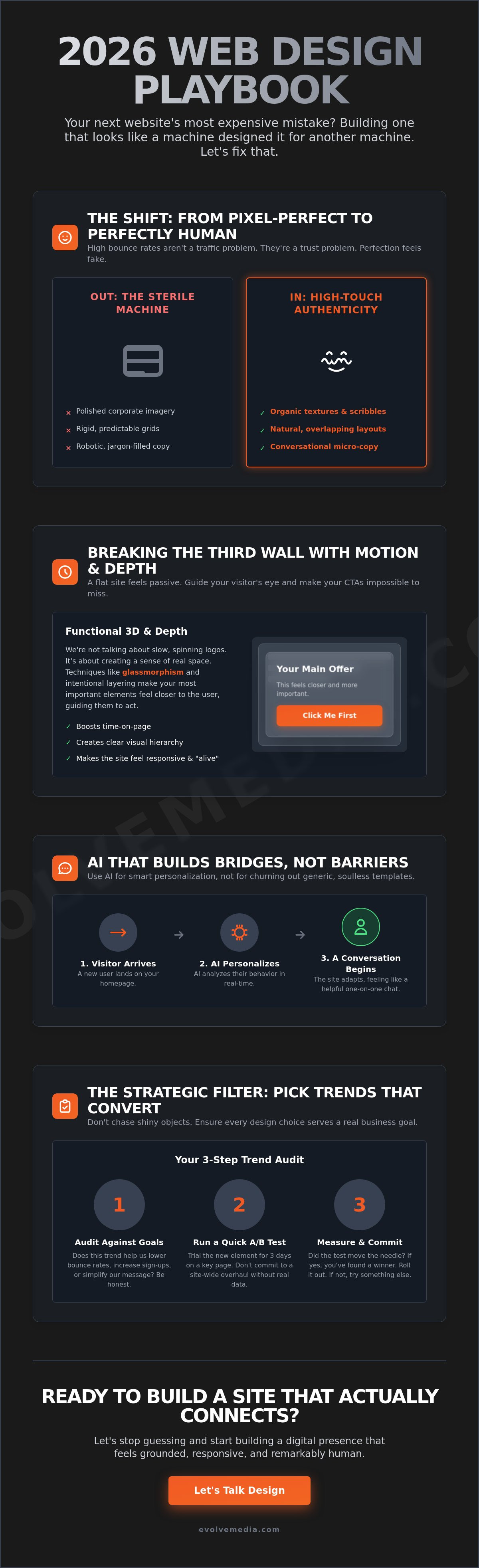
Perfection is boring. In fact, it’s starting to hurt your conversion rates. In 2026, web design trends are less about showing off what a computer can do and more about showing off the humans behind the machine. We’ve reached a point where browser capabilities have finally caught up with user psychology. People are tired of the cold, clinical look that AI templates spit out in seconds. Instead, they’re looking for digital spaces that feel lived-in and honest. While core web design principles still demand clarity and usability, the visual language has shifted toward “Cute-alism.” This movement blends approachable, playful visuals with serious business logic. It’s professional, but it doesn’t take itself too seriously.
Think of it as the death of the “stock photo” era. By using organic textures and hand-drawn elements, you’re signaling to your visitor that your brand has a pulse. This isn’t just a visual gimmick; it’s a strategic move to lower the natural skepticism people feel when browsing a modern site.
To better understand how these visual shifts are taking over, watch this helpful video:
The Psychology of the Human Scribble
Raw, unpolished graphics are outperforming high-gloss imagery by a wide margin this year. When a design looks too perfect, our brains often flag it as “generated” or “untrustworthy.” A hand-drawn line signals that a human was actually there. For example, a major B2B data firm recently replaced their complex, tech-heavy diagrams with hand-sketched icons. The result wasn’t just a prettier page; it actually helped users digest complex information faster because the “scribbles” felt like a mentor explaining a concept on a whiteboard. It builds immediate trust through shared vulnerability.
Authentic Storytelling Through Micro-Copy
Your design needs to speak, literally. We’ve moved away from robotic, over-polished language toward conversational brand voices that sound like a real person. This isn’t just about the words; it’s about how they look. Typography in 2026 often mimics a personal note, using variable fonts to add subtle, human-like weight changes to the text. High-Touch design is the deliberate choice to prioritize human craftsmanship and emotional resonance as a direct response to the sea of generic, AI-generated content.
- Use organic textures: Subtle grain or paper-like backgrounds can make a screen feel tactile.
- Ditch the grid: Let elements overlap in a way that feels natural.
- Keep it simple: A single hand-drawn arrow can guide a user better than a flashing button.
Motion and Immersion: Breaking the Third Wall of the Web
The web isn’t flat anymore. In fact, if your site feels like a static piece of paper, your visitors are probably already hitting the back button. We’ve moved into an era where web design trends prioritize depth and physical presence to keep people engaged. It’s about breaking that “third wall” between the user and the screen. By using 3D elements and tactile textures, you aren’t just showing off. You’re creating a sense of space that feels real and reliable to a skeptical audience.
Functional 3D: Not Just for Show
3D is finally growing up. It’s no longer just a spinning logo that slows down your load time. In 2026, we’re seeing interactive product models replace boring static galleries. If a customer can rotate a product or see how a tool works in a three-dimensional space, they stay longer. Statistics from early 2026 suggest that sites using functional 3D see a noticeable boost in average time-on-page. It’s a visual hierarchy trick. You can use depth to literally pull your primary offer toward the user, making it the most obvious thing on the screen. Staying current with these web design trends ensures your site doesn’t just look new, but feels essential.
Motion with a Purpose
Subtle motion is the secret sauce for reducing bounce rates. When a user scrolls and elements gently slide into place, it provides a sense of progress. These micro-interactions give instant feedback to every click, making the site feel responsive and “alive.” However, we follow strict rules to avoid “motion sickness.” Animation should be helpful, not distracting. You can learn how we integrate motion in our web design and development to see this balance in action. It’s about guiding the eye to high-value buttons using the “Frosted Touch” of glassmorphism without overwhelming the senses.
We’re also seeing a massive wave of “Retrofuturism” and “Dial-Up Delight.” This 2026 trend leans into nostalgic tech aesthetics, like neon gradients and glitchy textures. It sounds counterintuitive, but these nods to the early internet build a unique bond with users who remember the “good old days.” It adds a layer of personality that a sterile site just can’t match. If you want to see how these elements could fit your brand, let’s chat about your next project.
Smart Design: Using AI to Build Bridges, Not Barriers
AI has finally moved past the “uncanny valley” phase. In 2026, the smartest web design trends focus on using machine learning to remove friction, not just to show off. We’re seeing a major shift toward “Resonant Stark” design. This style uses minimalist interfaces that get out of the way and value the user’s time. It’s about being helpful, not loud. By stripping away the noise, you let the AI do the heavy lifting in the background while your visitors enjoy a clean, fast experience.
Dynamic Content Delivery
Your website shouldn’t treat every visitor exactly the same. If someone arrives from a professional LinkedIn thread, they need a different hook than someone who found you through a quick Google search. You can now tweak your headline automatically based on the referral source. It’s a small change that makes a huge difference in how professional you appear to specific audiences. We’re also seeing more personalized dashboards that remember what a user looked at last time, even without a login. It feels like walking into a shop where the clerk already knows your preferences. AI-driven personalization is the new standard for user retention because it transforms a generic broadcast into a relevant, one-on-one conversation.
This move toward tailored, human-centric interaction is happening everywhere. In the world of international education, for example, you can discover more about One-on-one Student Advisory Calls to see how personal mentorship is replacing generic digital brochures.
Designing for Voice and AI Search
With the dominance of Search Generative Experience (SGE), the way we structure homepages is changing fast. People aren’t just typing keywords anymore; they’re asking complex questions. This is pushing web design trends toward chat-based navigation over traditional, clunky menus. Instead of digging through three layers of links, users can just ask the site where to find what they need. It’s the “hands-free” browsing era, and your layout needs to support it.
This predictive lead nurturing anticipates the next question before the user even clicks. It keeps the journey moving without any dead ends. If you’re curious about how these smart tools can actually help your bottom line, let’s talk about your next project.
The Strategic Filter: How to Pick Trends That Actually Convert
Stop chasing shiny objects. Most web design trends are just noise designed to sell templates, not products. If you try to adopt every new visual gimmick, you’ll end up with a Frankensite that confuses your visitors and slows down your server. You need a filter. You need a way to look at a “must-have” feature and ask if it actually helps your bottom line or just makes your designer feel trendy.
The ROI Audit for Trends
Before you change a single line of code, ask if the trend solves a real user pain point. If your bounce rate is high, maybe that flashy 3D animation isn’t the answer. It might actually be the problem if it adds three seconds to your load time. We recommend a “test before you invest” approach. Run a 3-day A/B test on a single landing page before committing to a site-wide overhaul. This gives you real data on how your specific audience reacts to a change. If you aren’t sure where to start, you can contact us for a strategic design audit to see what’s actually worth your budget.
Implementing a Sustainable Digital Strategy
In 2026, sustainability is the ultimate trend that isn’t a fad. It’s about efficiency. Low-energy code and green hosting aren’t just good for the planet; they’re great for performance. For example, implementing dark mode isn’t just an aesthetic choice. It’s a power-saving and accessibility feature that users now expect. You also need to keep an eye on regulations. The U.S. Department of Justice now requires public entities to meet WCAG 2.1 Level AA standards by April 24, 2026. Making your site accessible isn’t a “trend,” it’s a legal necessity that also happens to improve your SEO. You can learn more about how our hosting services support high-performance design and keep your site compliant.
Your best asset in a world of pop-up brands is your own reliability. While others are busy adding glitch effects and neon gradients, your history of stability is what builds long-term trust. We’ve been helping brands find this balance since the early days of the web. We don’t just follow web design trends; we filter them through decades of experience to ensure your site reflects your brand’s true maturity.
- Audit for speed: If a trend adds more than 0.5 seconds to your load time, ditch it.
- Check compliance: Ensure every new element meets the April 2026 WCAG deadline.
- Prioritize longevity: Pick styles that will still look professional in 2028.
Build for the Future, Not the Algorithm
The digital world moves fast, but web design trends in 2026 have proven one thing: people still buy from people. Whether you’re integrating functional 3D motion or using AI to serve dynamic content, the goal is always the same. You want to build a bridge of trust that makes your brand the obvious choice. Don’t let your site become a sterile machine. Keep it human, keep it honest, and keep it fast.
Since 1996, we’ve helped diverse clients move past passing fads to build digital assets that actually last. From complex online applications to high-performance ecommerce development, our focus is on long-term growth rather than quick visual tricks. We’re not just a vendor. We’re your strategic partner in making sure your design reflects your brand’s maturity and expertise.
Ready to turn these trends into a growth engine for your brand? Let’s talk.
Your next site doesn’t have to look robotic or dated. It’s time to build something that truly connects.
Frequently Asked Questions
What are the biggest web design trends in 2026?
The most dominant web design trends in 2026 focus on proving human authorship in an AI-saturated world. We’re seeing a massive move toward tactile brutalism, which uses raw geometry and simulated physical textures to create a sense of reality. Organic shapes and earthy palettes are replacing the sterile, grid-based layouts of the past. It’s all about making the user feel like they’re interacting with a real person rather than a sequence of code.
Should I use dark mode for my business website?
You should almost certainly offer a dark mode option because it’s now considered a standard accessibility and power-saving feature. It helps reduce eye strain and saves battery life on modern OLED screens. Beyond the utility, it gives your site a premium, modern feel that many users prefer. Just make sure you’ve tested your color contrast to meet the April 24, 2026, WCAG 2.1 Level AA deadline for legal compliance.
How does AI affect web design and user experience?
AI has shifted from a buzzword to a practical co-designer that handles the tedious parts of layout optimization and automated A/B testing. It now powers hyper-personalized user journeys that adapt to a visitor’s behavior in real-time. This means your site can suggest specific products or content based on what a visitor actually needs. It’s about using these web design trends to build bridges rather than barriers between you and your customers.
Are retro designs still popular for professional brands?
Retro elements are making a massive comeback because they trigger a sense of nostalgia and trust that feels authentic. Trends like “Light Skeuomorphism” use subtle shadows to mimic real-world objects, making your digital space feel more grounded and tactile. Professional brands use these touches to stand out from the sea of homogenization created by generic AI templates. It proves you’ve put thought into the craftsmanship of your digital presence.
Will a new web design improve my SEO rankings?
A design refresh can absolutely boost your rankings if it improves your core web vitals and user engagement metrics. Search engines prioritize sites that offer a superior user experience, including fast load times and mobile responsiveness. Since modern browsers now fully support native CSS Nesting and Container Queries, your site can be more efficient and maintainable. Google notices when users stay longer and interact more with your content.
How often should I update my website’s design to stay current?
Most professional brands should consider a significant design refresh every two to three years to keep up with shifting user expectations. However, you don’t need a total overhaul to stay relevant. Small, strategic tweaks like updating your typography or refining your micro-interactions can keep the experience feeling fresh. The goal is to ensure your site reflects your current brand maturity without letting it look dated or sluggish compared to your competitors.